Visual analysis of the Chicago bike rides
Origin-Destination (O-D) matrices are prevalent data structure in the field of transportation analysis. They provide information on how many people move between fixed set of locations e.g. between metro stations, bus stops or airports in a certain time interval. They also represent the network where the nodes are formed by the locations and edges by the people flows between them. Visualizing this kind of data is challenging but potentially very beneficial. Understanding how people move across transportation network can result in the optimization of many important properties of the network e.g. cost reduction or travel time reduction. Understanding is also crucial for performing tasks such as fleet rebalancing and scheduling or spotting bottlenecks.
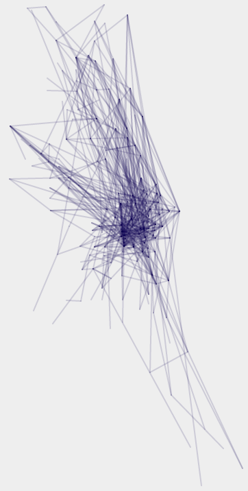
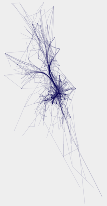
There are several excellent visualization types well suited for presenting origin-destination data e.g. chord diagram or Circos but due to the spatial dimension of the data we often expect a map representation to be used. In that case we could visualize the matrix as a graph where the nodes have fixed position defined by their geographical coordinates. We can choose to represent the flows of the people between the nodes using straight lines, which would form a node-link diagram, but in that case the picture quickly becomes cluttered and unreadable as the number of connections or nodes grows - see picture below, left side. We could play with the opacity to expose the main patterns or use techniques like edge bundling that try to represent the edges of the graph not as straight but as curved lines in order to reduce visual clutter and make global trends and pattern more easily noticeable - see picture below, right side. This technique focuses however on exposing global network patterns and little can be said about particular nodes. In this article a variation of the node-link diagram is presented that could be useful for analysing the local properties of the network.
Data
I will use Chicago bicycle data set which holds information about bicycle rides between different bike stations in the city of Chicago. The data comes from a bike sharing system in which people can rent a bicycle from one of the 476 stations across the city for a short period of time and after they use it they return the bicycle at a different station (I will refer to it as a trip). This means that the nodes of the network are bicycle stations and nodes are the trips between them (this is also an O-D matrix). Data can be collected because each user of the network uses special key when renting a bike. Full data set spans over several weeks and was released as a part of the data visualization challenge organized by the Divvy. For the purpose of this analysis only one week of the data from August 26th to September 1st 2013 was selected. Data was aggregated in one hour intervals and the number of trips between particular two stations can be considered as a weight of the edge in the graph which will be further used in the visualization and will be mapped to the opacity of the edges. Two networks on the image above represent one selected interval from that dataset.
Variation of the node-link diagram
The starting point to generate the proposed variation of the node-link diagram is a node-link diagram with edges represented by the straight lines as in the picture above on the left side. The proposed variation will modify how each edge is drawn. Instead of using a solid color for the entire edge a color gradient is used. The color of the gradient at the origin node is different than the color of the gradient at the destination node. Then, only first and last 10% of the edge is displayed with the smooth opacity change from 100% to 0% - as explained in diagram below. 10% is an arbitrary choice and could vary depending on the network. Moreover, the opacity of the entire edge is mapped to the variable mentioned in the Data section which is the number of the trips between certain bike stations. This variable is mapped to the opacity of the edge using linear scale in the way that the edge with the maximum value in the data set will have opacity value of 1 and edge with the minimum value will have opacity value of 0.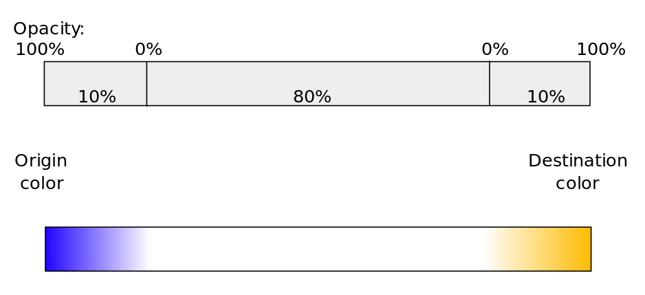
Applying above mentioned rules to the node-link diagram of the Chicago bicycle sharing network data set with the blue color for the origin and orange color for the destination can be seen on picture below. The network is placed on top of the Chicago city map. It shows the bicycle trips between 4PM and 5PM on Wednesday August 28th - same as two networks in the first picture of this article. As a result the overall network structure disappears but all the nodes and their incoming and outgoing connections are visible.
Each node is characterized by its own local pattern which can be effectively analyzed giving immediate insights on how the station operates. For example, whether there are more incoming or outgoing trips can be judged by looking at the color of the node. Analyzing one particular node we can see incoming trips in orange and outgoing trips in blue. Length of the lines represent how long the trips were. We can also observe directions of the outgoing and incoming trips.
Going back to the map below the whole bike sharing system can be analyzed. What we see is the afternoon view of the city with many people taking bicycles from the city center (blue nodes) and going back to the residential areas on the city outskirts (orange nodes). Tasks like spotting the outliers which could be stations operating small number of rides or identifying unbalanced stations i.e. those which operate mostly outgoing or mostly incoming rides can be performed quickly using this visual representation.
Change the opacity of the gradient using the slider to see how this visualization is derived from the simple node-link diagram: